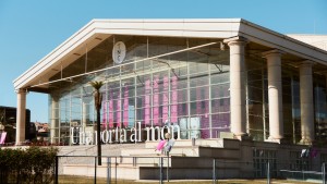
Disseny Market Barcelona
Made to Evolve
Design Market had grown organically over the years, with each edition developing its own visual language. As the event became an established part of Barcelona's cultural calendar, it needed a more coherent identity capable of bringing consistency across every touchpoint while remaining flexible enough to evolve over time.
For the 2025 edition, the challenge was to create a graphic system that could unify the event without limiting its constantly changing nature.
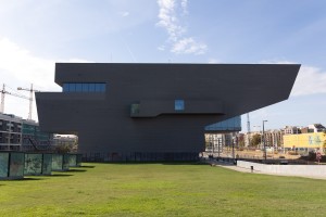
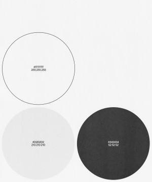
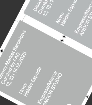
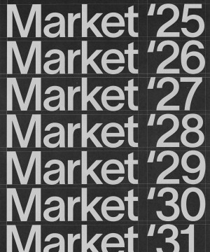
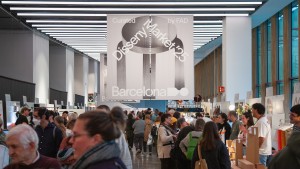
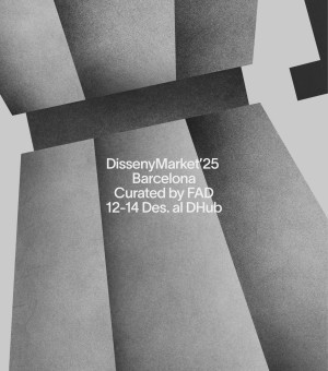
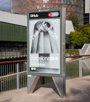
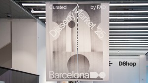
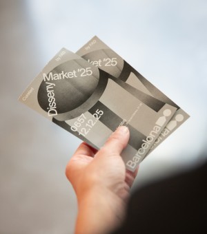
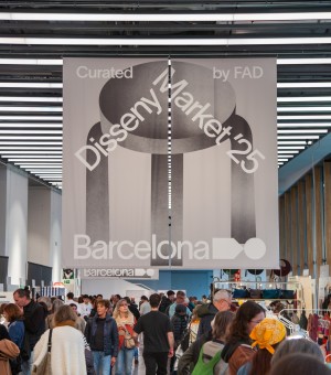
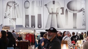
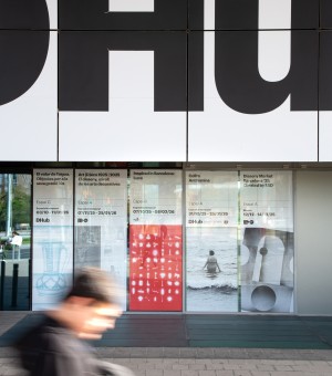
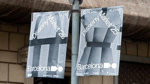
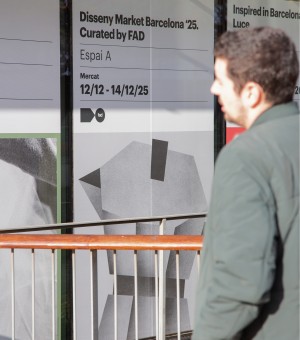
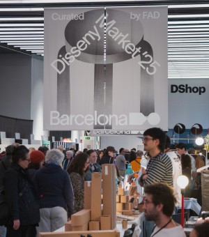
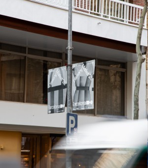
The identity was built around the relationship between illustration, typography and the FAD symbol, bringing them together into a single graphic system. Rather than acting as a logo alone, the symbol became a framework that organised content across formats while allowing each application to adapt to different messages and contexts.
Motion played a central role in extending the identity into digital environments. Animated illustrations introduced movement and variation across social media, digital screens and the DHUB, reinforcing a recognisable presence throughout the campaign. The result is a flexible system that gives each edition room to evolve while maintaining a clear and consistent identity.
Credits:
Photography: Juan Tribaldos
Typeface: Lausanne 500 - WELTKERN
Recognitions:
2026
Silver Laus, Animated Campaign
Bronze Laus, Print Campaign
InBook Laus, Applied graphics in space