Nobles i Guillotines
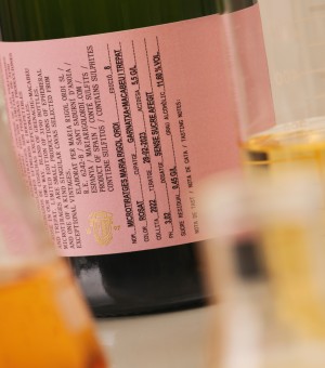
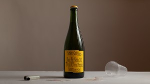
This project began with a brief that felt almost like a contradiction: to build a brand identity for a Pét-Nat wine that was both deeply natural and deliberately disruptive. A product rooted in tradition, yet increasingly defined by its rejection of it. The challenge was to translate this tension into a visual system that can speak to a contemporary, alternative audience without neutralising its rawness.
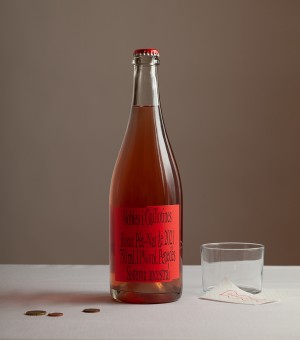
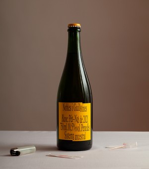
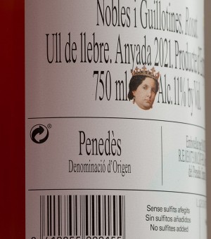
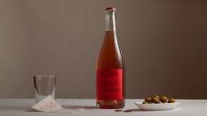
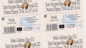
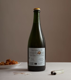
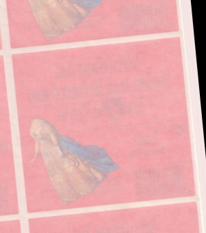
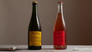
The identity was built around the tension between tradition and disruption. Rather than adopting the refined language commonly used by wine brands, it reinterprets classical references through distortion, contrast and unexpected compositions. Familiar visual elements are deliberately altered, questioning the conventions that have long defined the category.
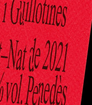
Typography, imagery and layout work together to create a graphic system that feels expressive without losing coherence. Every element contributes to an identity that reflects the character of the wine itself: raw, unconventional and shaped by experimentation. The result is a distinctive visual language that positions Pét-Nat as a contemporary alternative while remaining connected to its winemaking roots.
Credits:
Photography: Felix Ruiz
Typeface: Times Now - JHA (Squeezed version)
Recognitions:
2022
Bronze Laus, Packaging Line/Label Design