Terravinyada
Going Back to Move Forward
Going Back to Move Forward
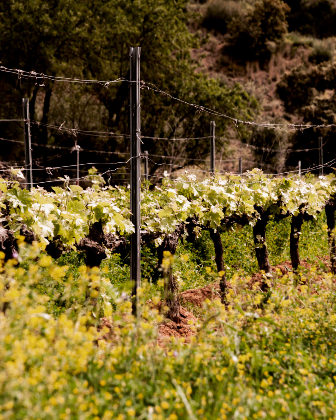
Terravinyada is an exciting new wine project that aims to produce and market exceptional wines made from organic grapes grown on their very own farm, located in Falset on the outskirts of Catalonia.
Driven by a profound emotional connection, this project goes beyond entrepreneurship. The creators yearned to reconnect with their roots and land, leveraging the experience they have gained over the years.
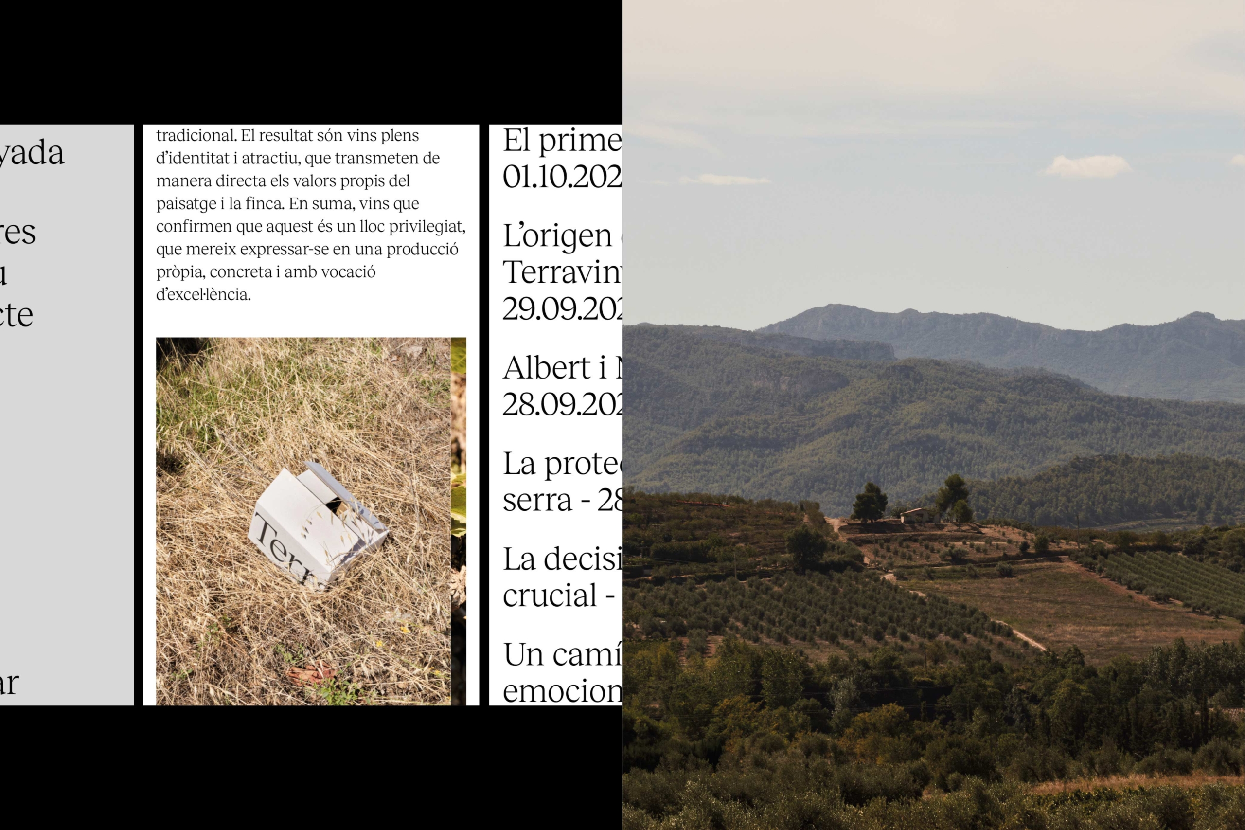
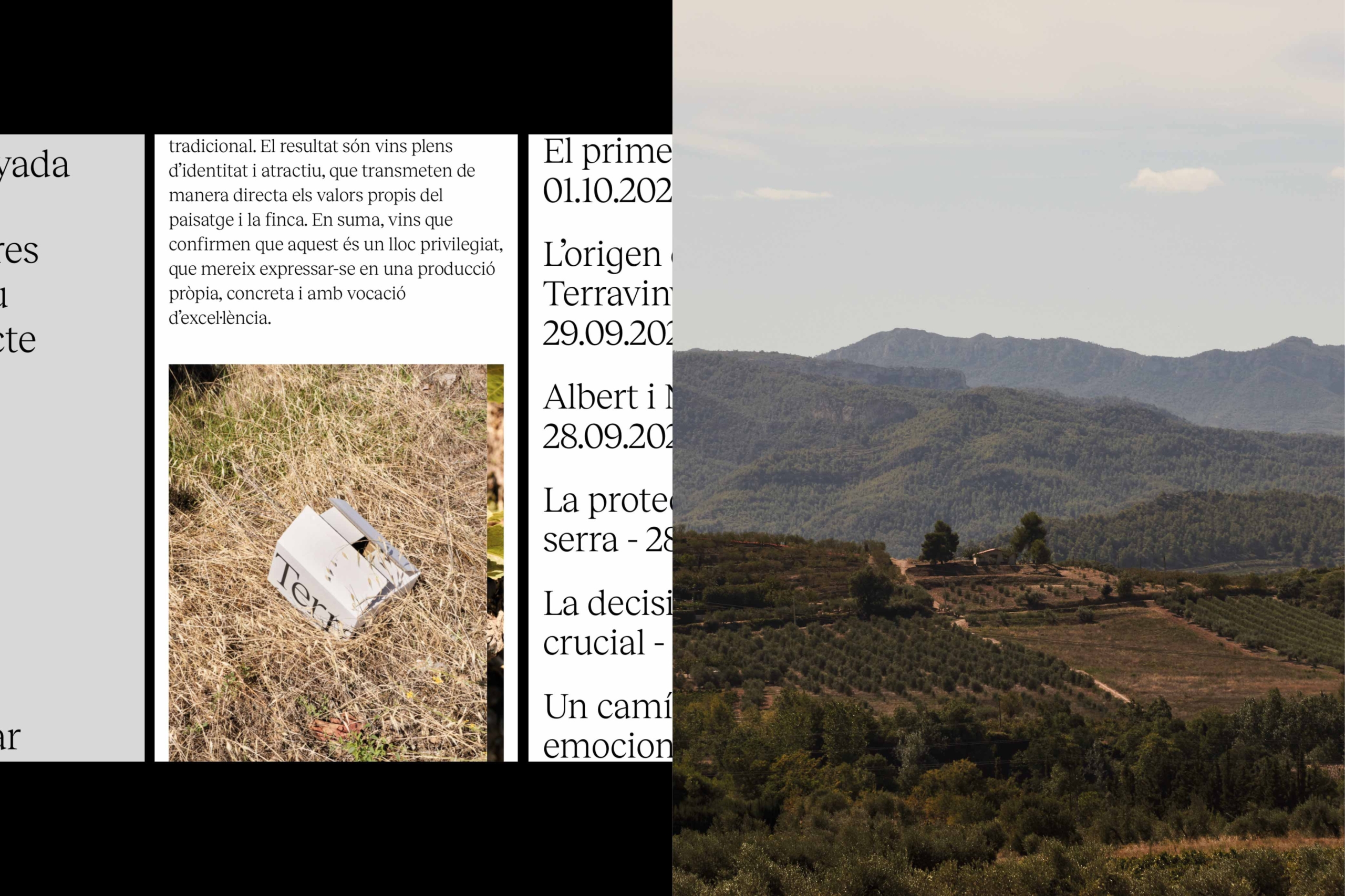
Our goal was to create a turning point in current consumption patterns, promoting a sustainable and authentic lifestyle. To achieve it, they’ve adapted to local conditions and embraced a traditional and respectful approach that has allowed them to interpret and create products influenced by the land itself.
Challenging the Pace of Current Production
With the purpose of honouring their roots and sharing their experience, we collaborated to develop the identity of this project.
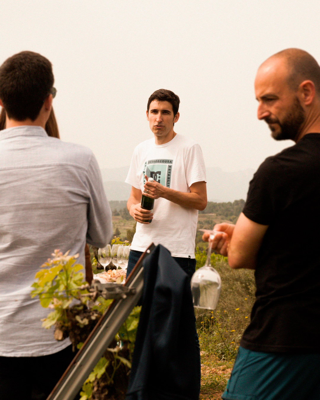
They approached us with a clear vision: preserve the wine tradition and transform it to evolve towards modernity. We recognised that to fulfil this purpose, we needed to distance ourselves from the language associated with large-scale production and emphasise the role of the oenologist as a curator and expert in the world of wine, utilising their knowledge and experience to serve the project.
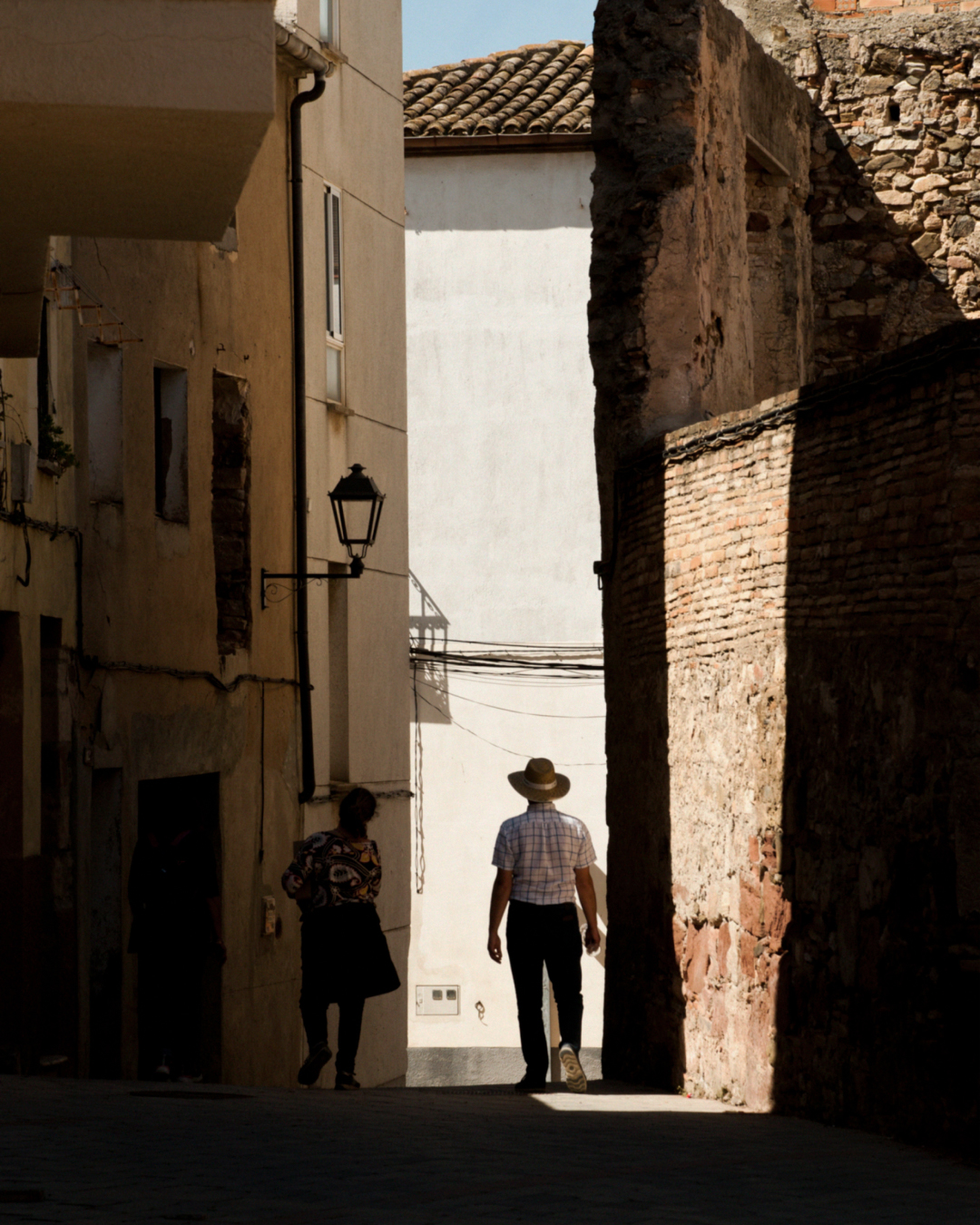
The Land that Produces Abundant Wine
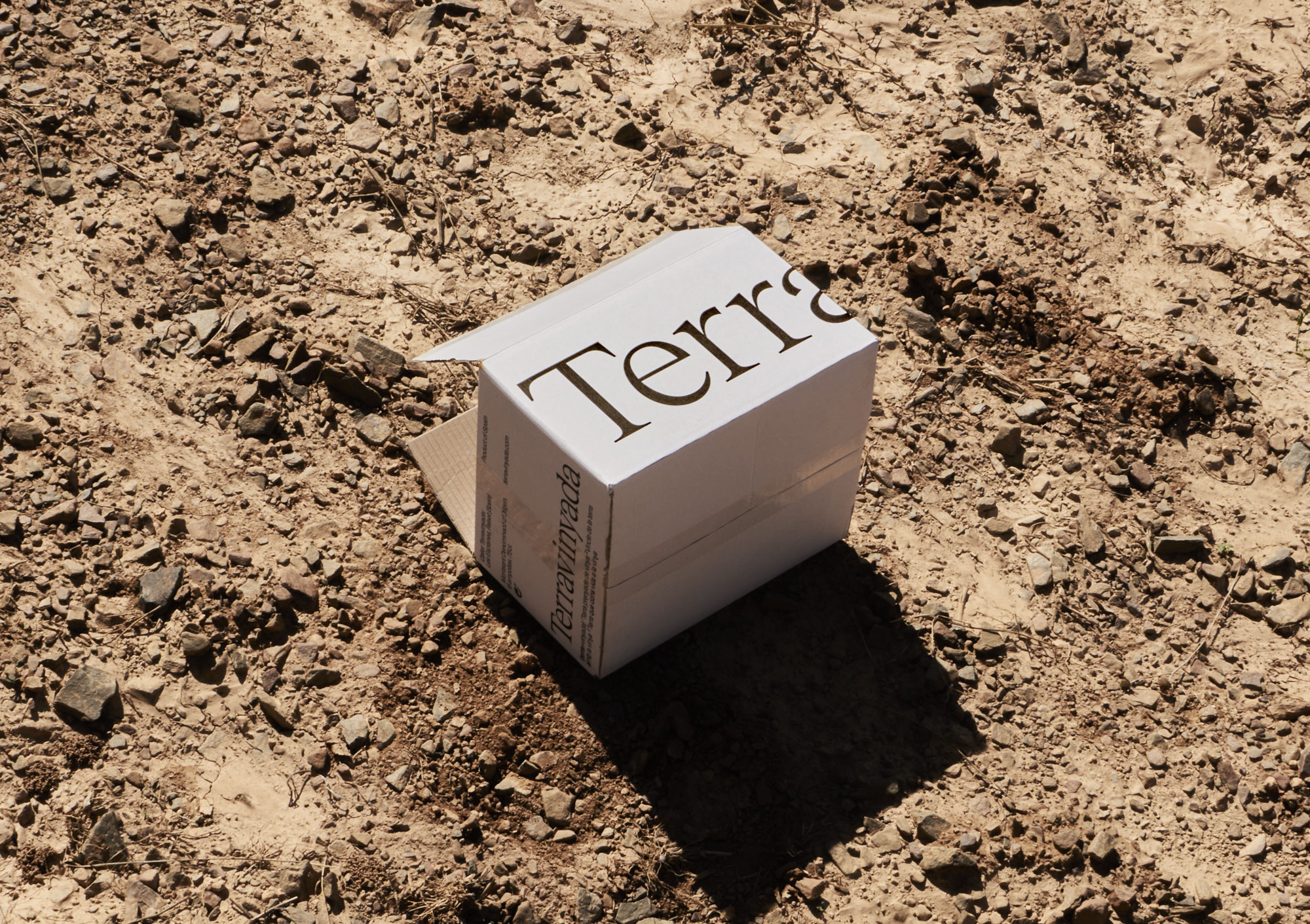
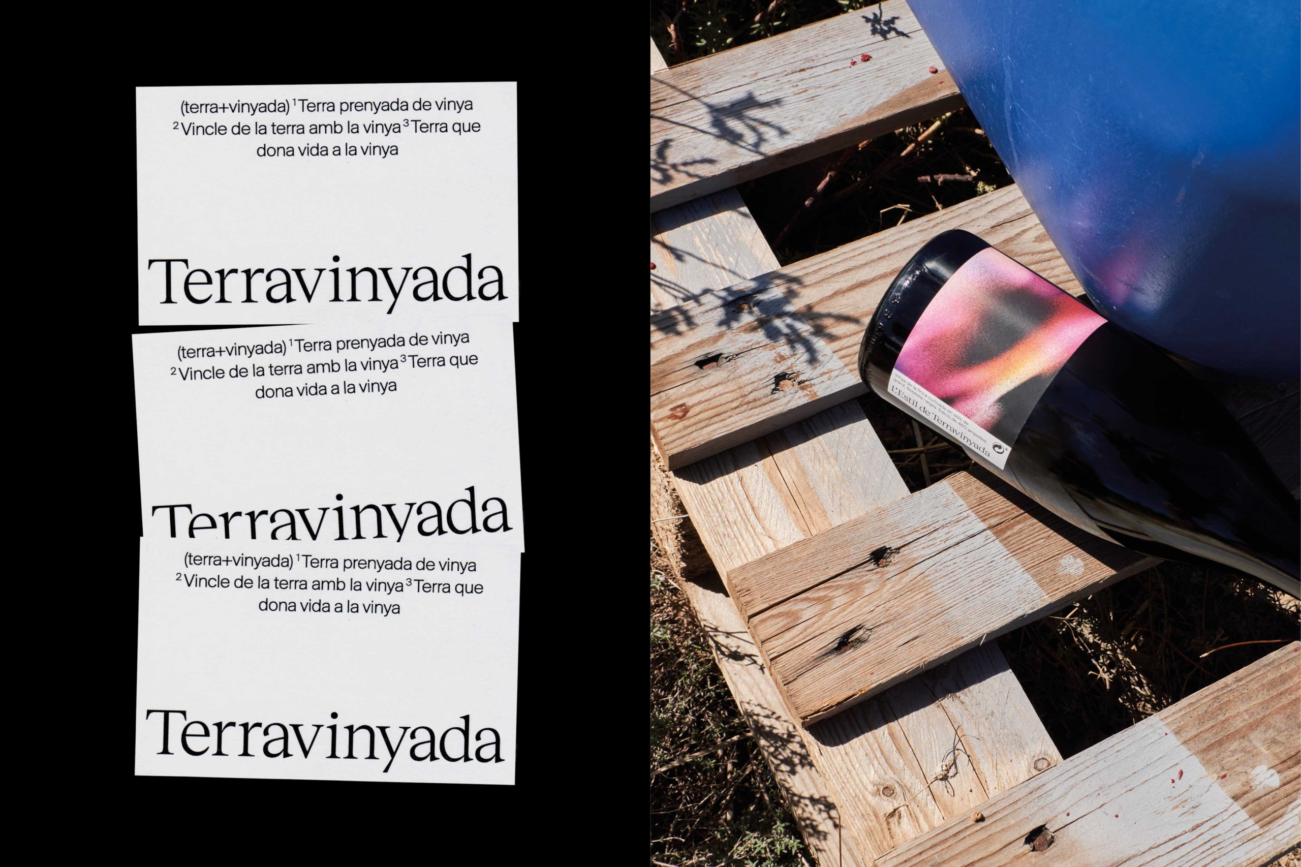
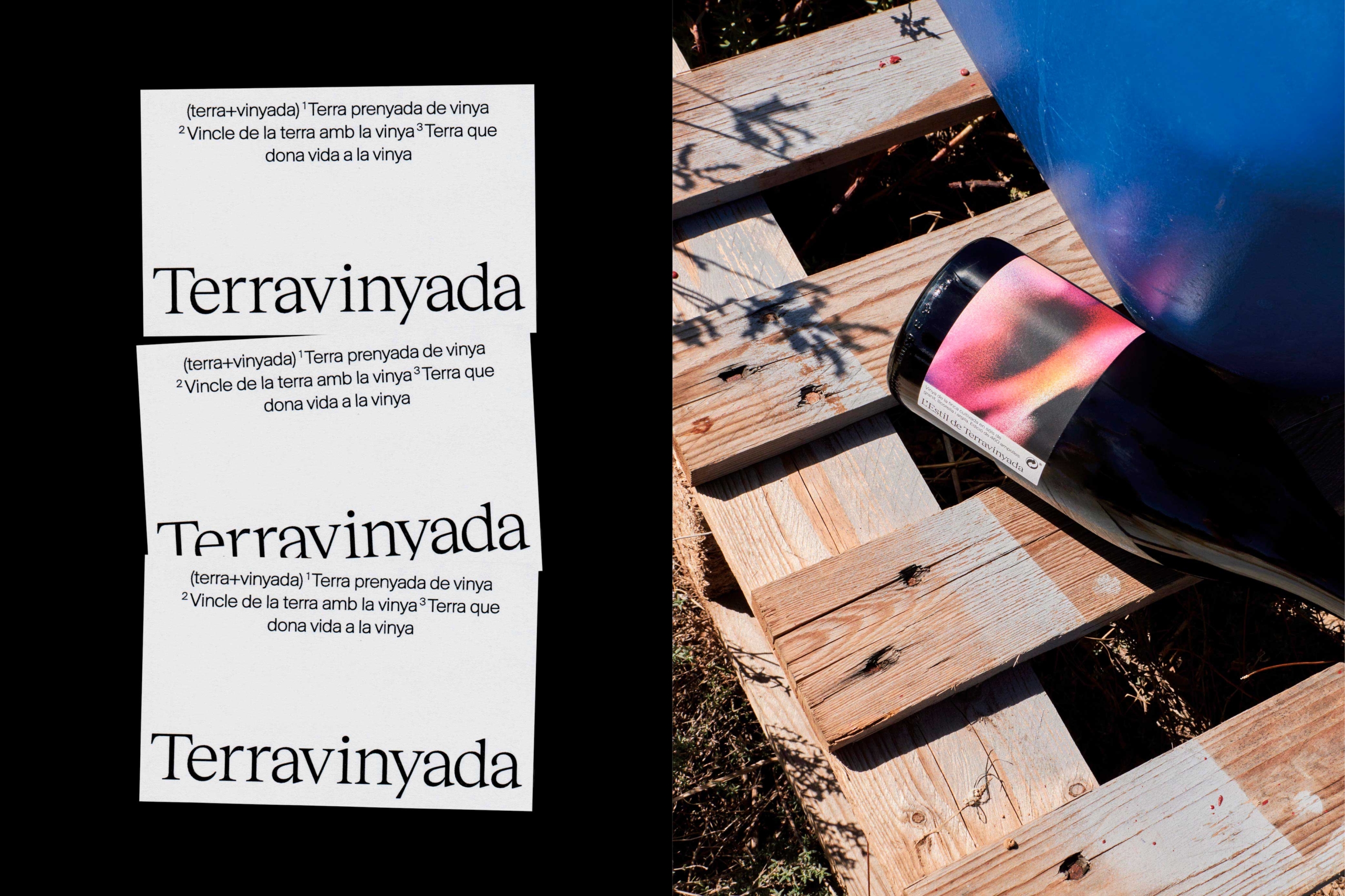
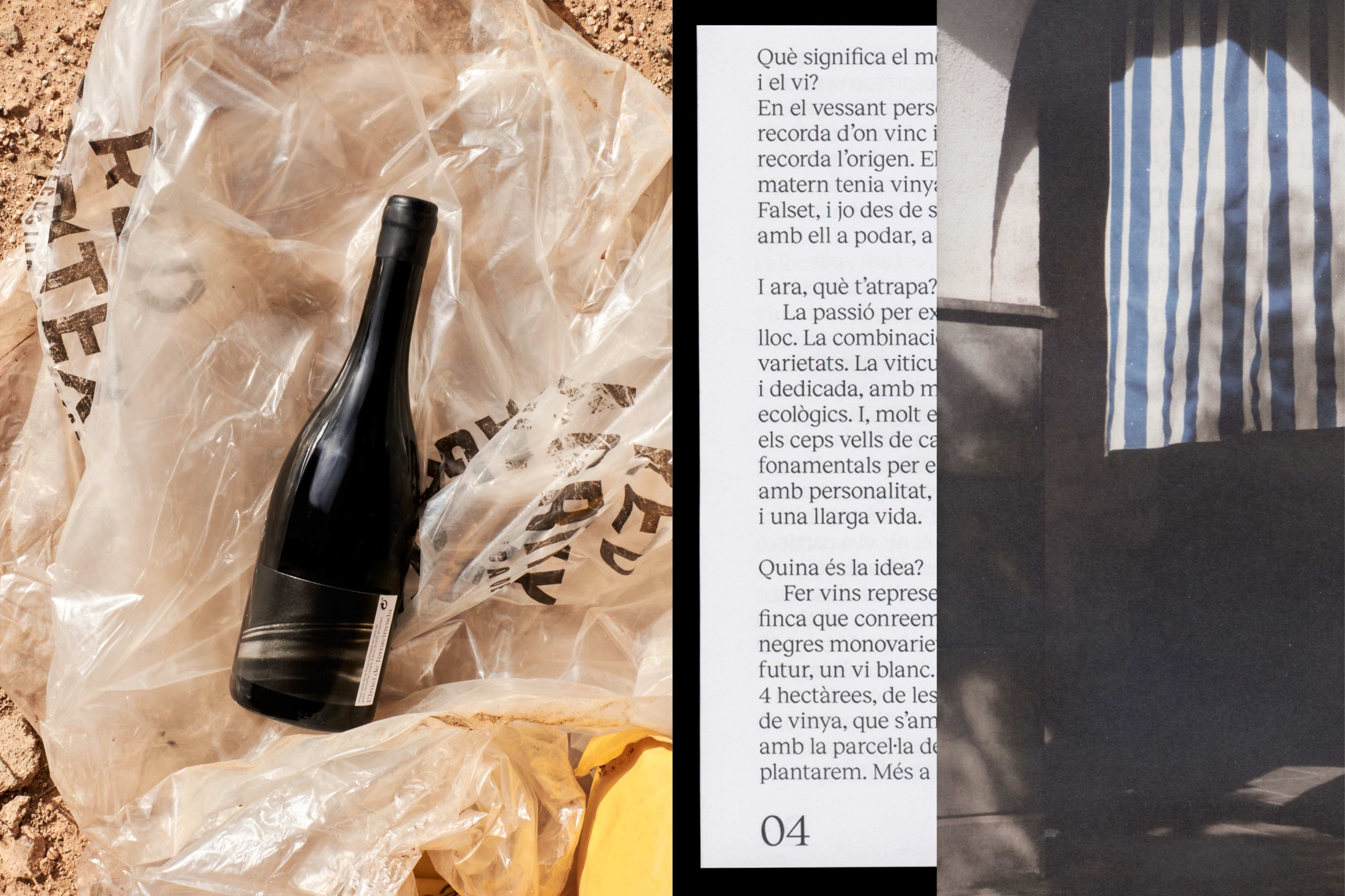
Remaining faithful to their conscious production as well as the intention to return to their origins as their main objective. We worked on the name of the project knowing it would play a crucial role in conveying this essence. We emphasised the concept of a land blessed by the vine and its fertile soil.
By playing with the word “vineyard” and transforming it into an adjective that reflects abundance and a state of rest allowing growth, we captured the pleasure of pursuing passion with care. Starting from the name “Terravinyada” (Terra (soil) + vinyada (producing abundant wine)), we crafted a narrative around this word, aligning it with the values that the winery seeks to convey.


A Coherent Story
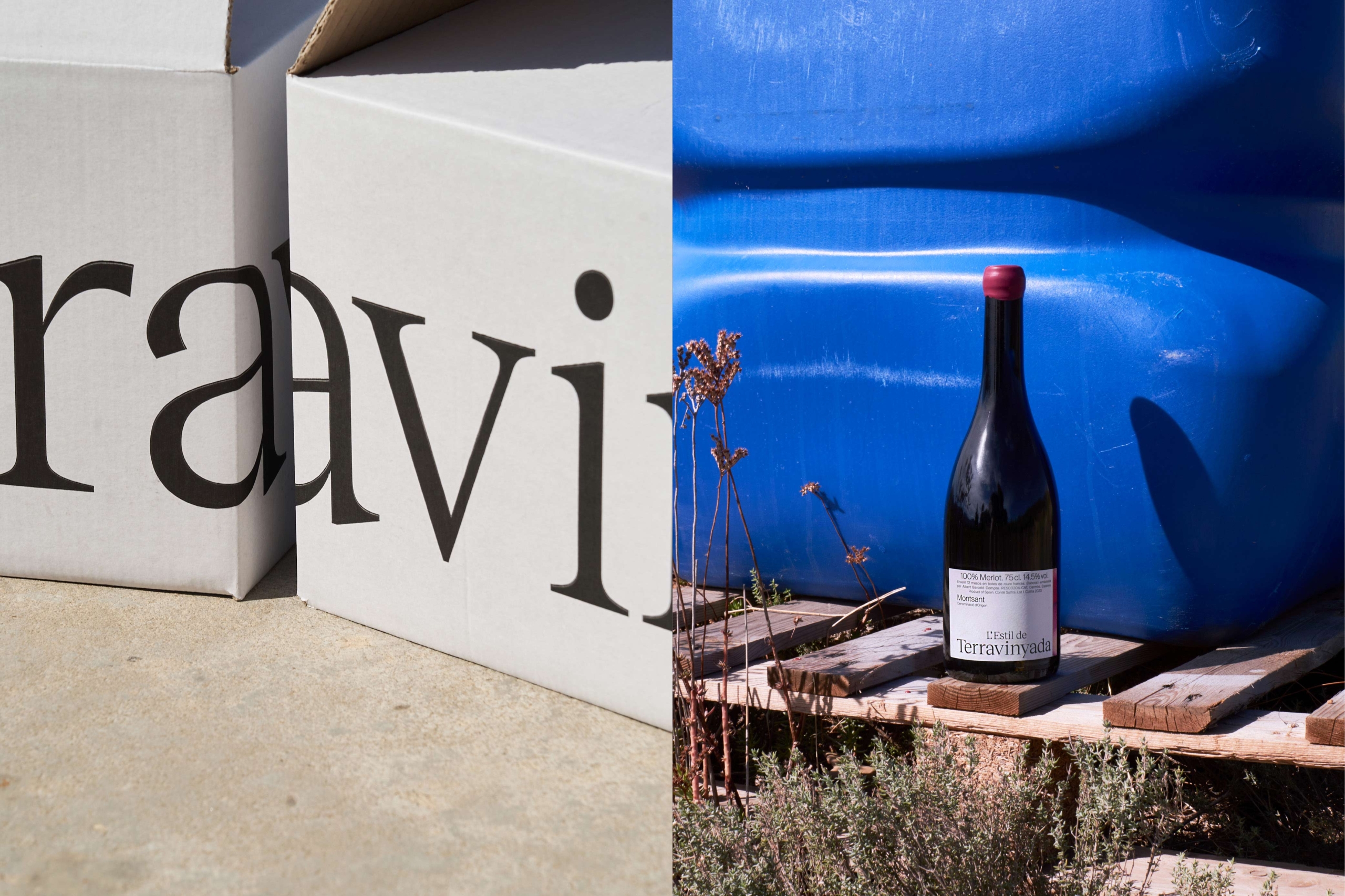
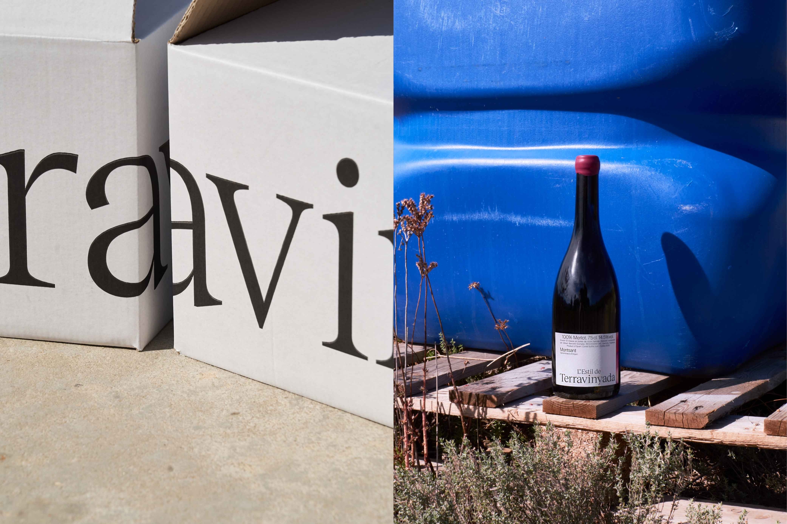
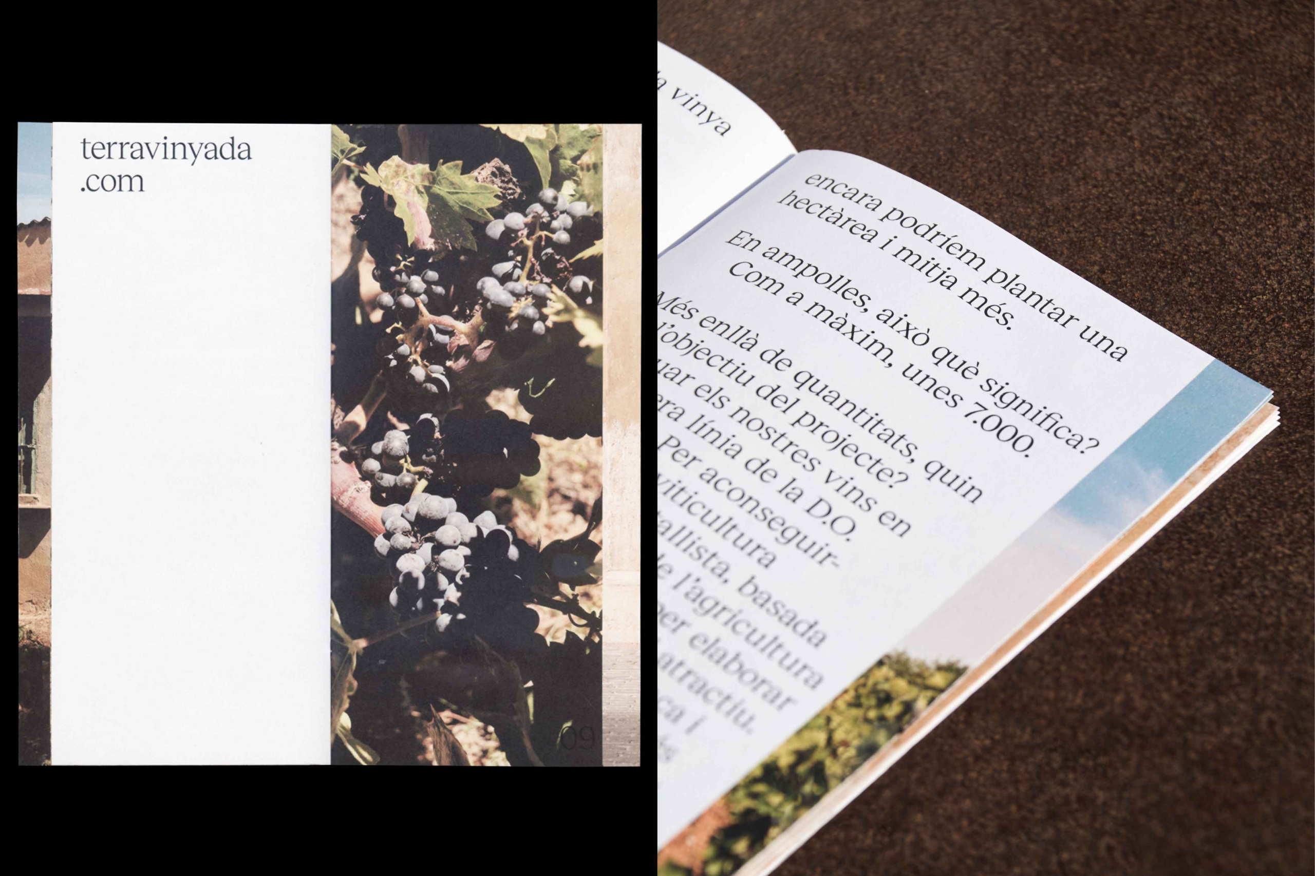
To maintain consistency in conveying our message visually, we decided to present the technical and emotional aspects as complementary elements. We showcased the technical information in black and white, while reserving colour and images to emphasise a more emotional and experimental side.
Thus, the identity was developed using contrasting visual elements to create two distinct parts. We moved away from definitions like “front” or “back” and instead united them as balanced concepts, which are reflected in other elements of their identity.


An evolving journey
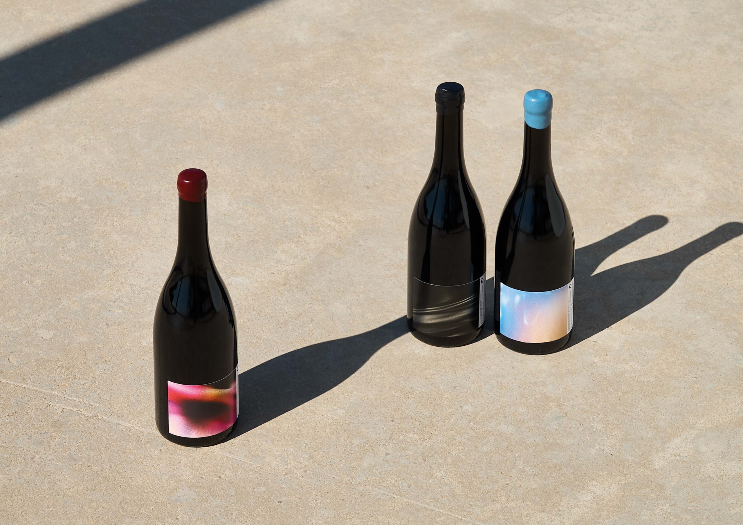
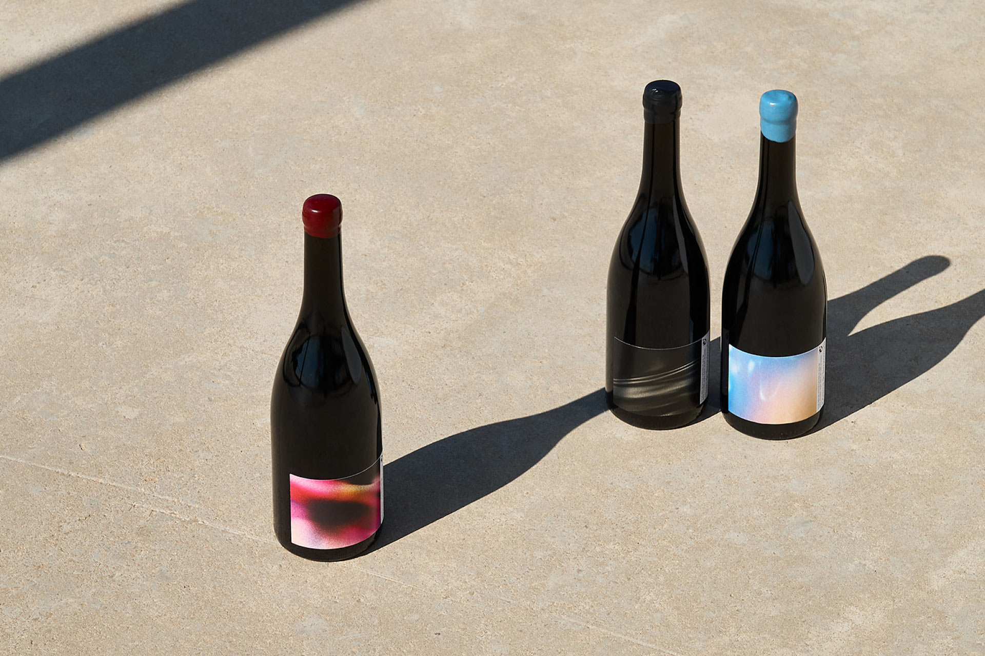
We aimed to showcase the experience applied in the project in a way that is both relatable and distinct from conventional approaches associated with the wine industry. That way, we presented their first three wines as stages of an evolving journey, united by their liquid essence.
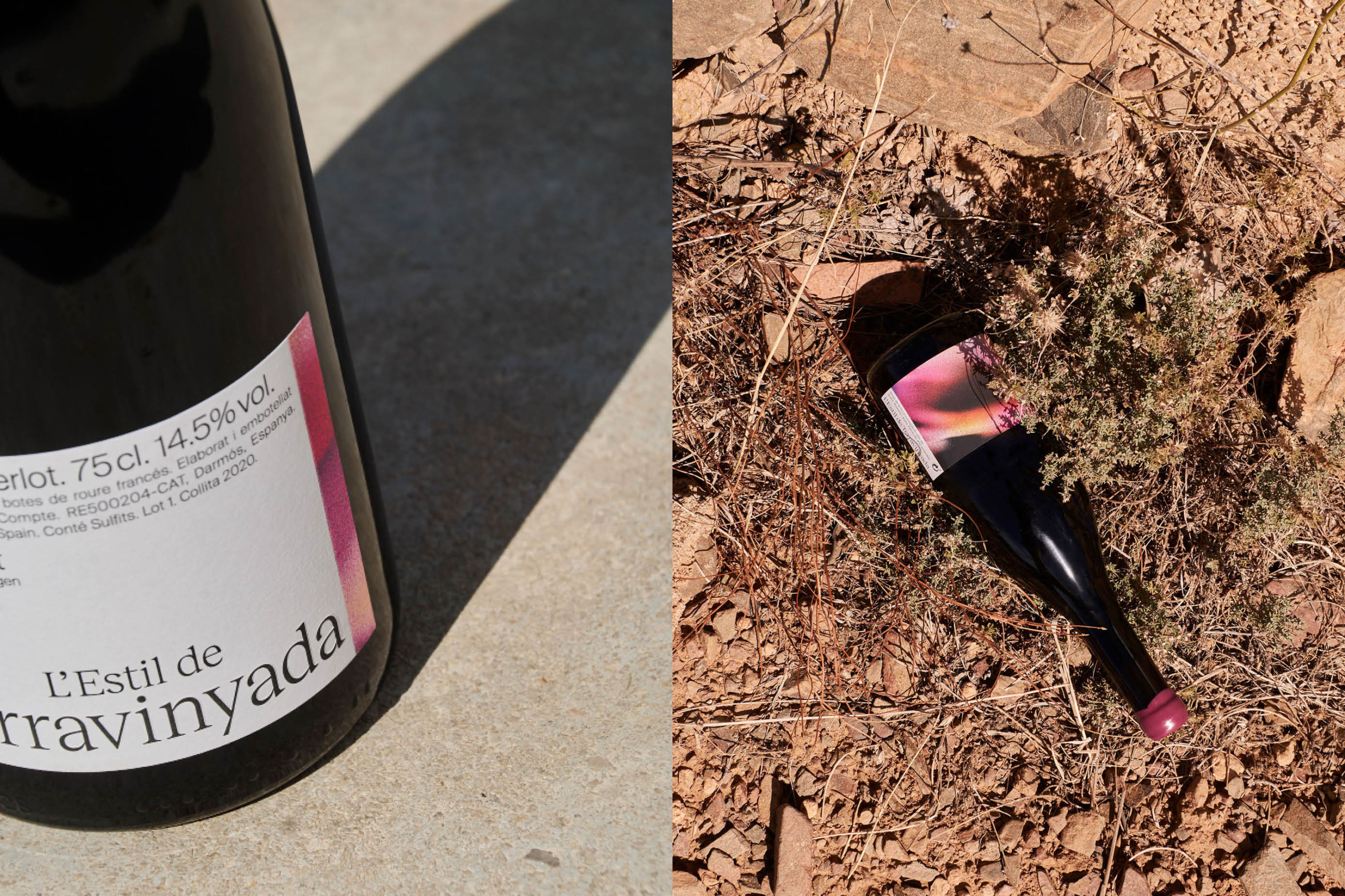
L’Inici: It represents the initial phase of the project. The name explicitly refers to time and style, reflecting the early steps of a creative process without distractions.
L’Estil: Time manifests in a vibrant array of colors blending with the initial black and white. Its appearance becomes more experimental, gaining character. This wine represents founding their own unique style.
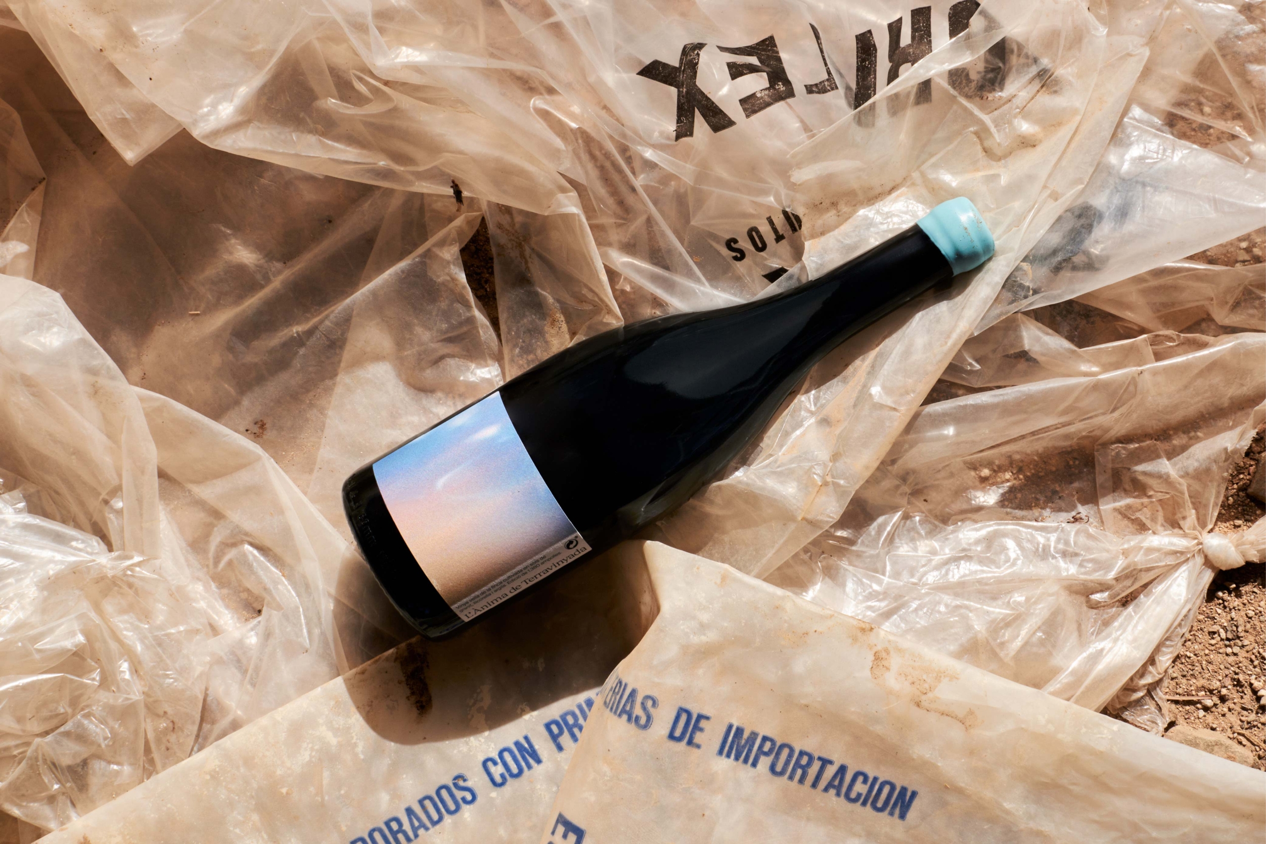
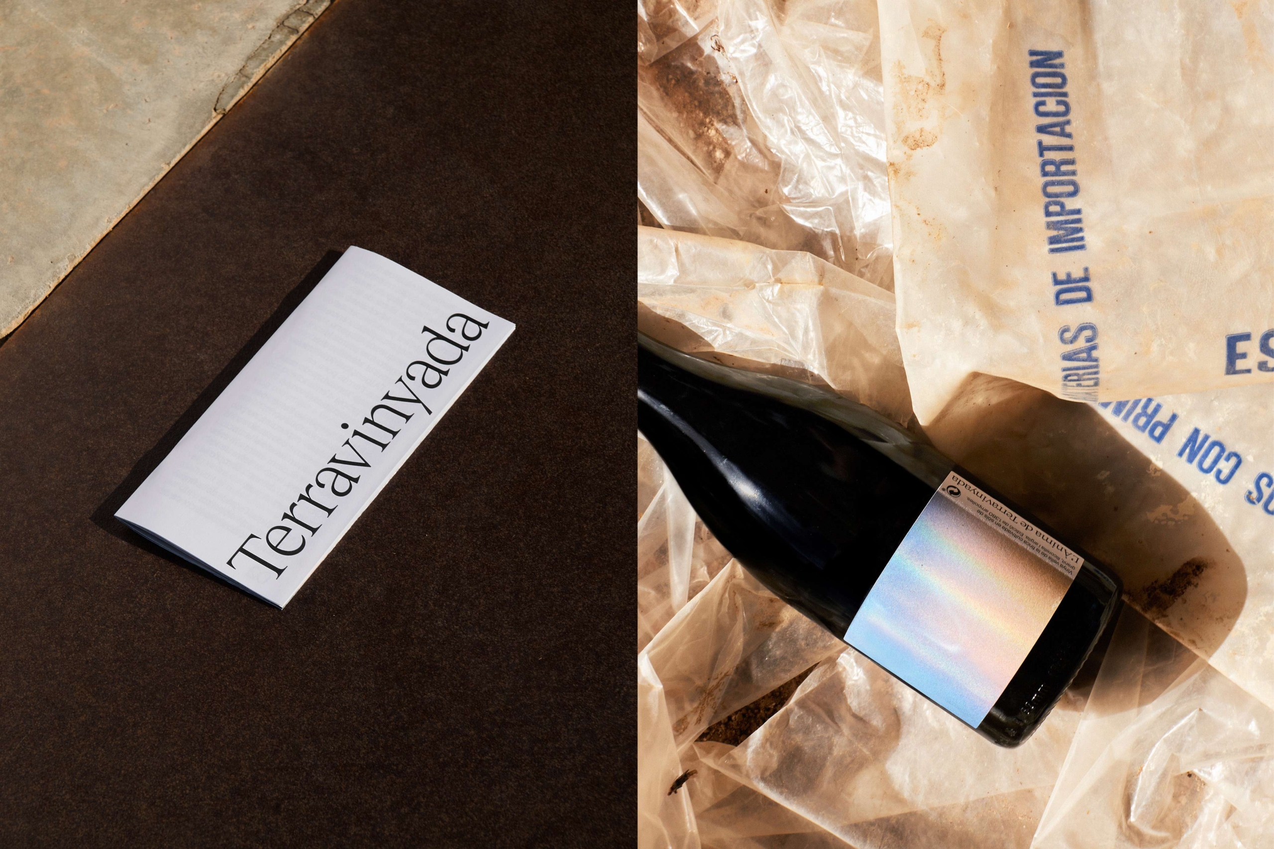
L’Ànima: The las wine pays homage to the wisdom acquired along the way, showcasing the most intimate side of their production. Thus, we present it in a more organic, abstract, and pure manner than its predecessors.
A Window to a New Movement
When working on their website, we strove to reflect the spirit and methodology of their winemaking. It embodies a restless and innovative wisdom that carries the essence of their place of origin without artifices.
We extended an invitation to explore their universe through small moments and captivating snapshots featured on the homepage, where the winemaker and his approach to wine serve as the driving force.
Accordingly, we engaged users through two different types of navigation. In the first one, we prioritised the emotional/experimental side by employing colour, creating a seamless experience that fosters a deep connection with the brand. In the second approach, we adopted a more traditional style characterised by a neutral colour palette and a technical focus.
Creativity, Sustainability, and Innovation
Through constant communication during the project’s development, we successfully brought the brand identity and essence of their wines to life, reflecting an authentic purpose.
Our team had the opportunity to immerse in their space and gain knowledge, that enabled us to craft a compelling story and grasp their profound connection to the world of wine, sustainable production, and respect for their roots.
This collaboration allowed us to understand the challenges and opportunities of this emerging brand, showcasing its creative, sustainable, and innovative sides.