Deià
The process of designing an identity ready to evolve as education and
culture do.
Art and Design school from Barcelona.
Teaching through innovation, participation and commitment
Deià, is an educational centre specialising in interior design in all its areas, and in the graphic image applied to space. They approach teaching through innovation, participation and commitment to culture and the environment.
One of our main challenges when working on updating its identity was to give the school greater visibility and unify the complexity of a very broad academic offer, speeding up its internal and external dissemination and its recognition among the community.
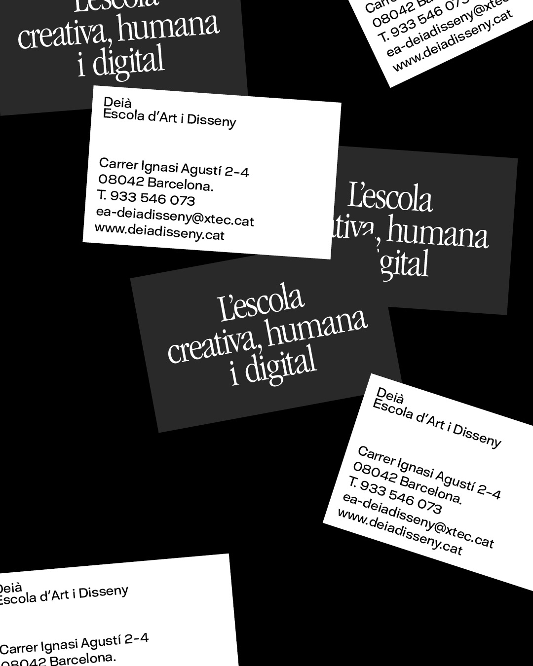
A clear and honest system
The process of separating topics, such as institutional communication, from other areas such as architecture and space or areas such as image and the arts degree began with creating a colour scheme.
From the beginning, one of the purposes of approaching our studio to renew its identity was to give a voice to its community and to achieve this, the use of typography was key. We chose a serif typeface dispensing hierarchies, limiting its weights and sizes in the texts to make it feel closer and democratize communication.
Images, as varied as those who are part of the community, were encouraged to promote spontaneous communication and a language accessible to everyone. As a result, we got a playful and approachable identity that reflects the spirit of the school and is ready to evolve as education and culture do.
An intuitive language for a tech-savvy generation
A brand system, with a current and approachable character, translated to be functional and easy to navigate, using a colourful block scheme that works as a recognizable guide for students.
By keeping it simple and convenient, we created a practical website where users can easily access information following these codes.